Manage Forms
A form contains a combination of sections and fields. You can use forms to capture data from your submitters within a program as well as create your own forms for your organization. When you add a form to a program, you must publish the form before submitters can start using them.
Note Forms created by you, as a health plan administrator, are available only to your organization account.
Create your custom forms
If the common forms provided by Edifecs do not fully suit your needs, you can compose your own forms with the user interface components you like. Below are the available components you can choose from, the properties they support, and the JSON code samples for you to quickly copy and customize.
 Text field Text field
Field declaration: "fieldType": "text"
Available properties:
- Label:
"title": "stringValue",
- Watermark:
"placeholder": "stringValue",
- Remarks:
"remarks": "stringValue",
- Minimum length:
"minLength": "numberValue",
- Maximum length:
"maxLength": "numberValue",
- Pattern:
"pattern": "stringValue",
- Default value:
"supported": "string/number/dateValue",
- Mandatory:
"required": "booleanValue",
- Read-only:
"readonly": "booleanValue",
- Repetition:
"repeat": {"min": "numberValue", "max": "numberValue"}.
Copy
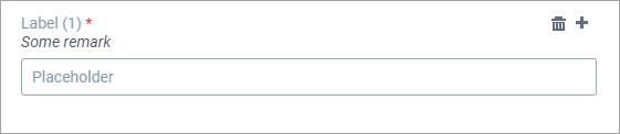
{
    "Text": {
                "fieldType": "text",
                "title": "Label",
                "placeholder": "Placeholder",
                "remarks": "Some remark",
                "minLength": "1",
                "maxLength": "9",
                "required": "true",
                "readonly": "false",
                "repeat": {"min": "1", "max": "9"}
            }
}
How it looks on the user interface:
Field for numbers
Field declaration: "fieldType": "number"
Available properties:
- Label:
"title": "stringValue",
- Watermark:
"placeholder": "stringValue",
- Remarks:
"remarks": "stringValue",
- Minimum value:
"minValue": "number/dateValue",
- Maximum value:
"maxValue": "number/dateValue",
- Pattern:
"pattern": "stringValue",
- Default value:
"supported": "string/number/dateValue",
- Mandatory:
"required": "booleanValue",
- Read-only:
"readonly": "booleanValue",
- Repetition:
"repeat": {"min": "numberValue", "max": "numberValue"}.
Copy
{
    "Number": {
                "fieldType": "number",
                "title": "Label",
                "placeholder": "Placeholder",
                "minValue": "0",
                "maxValue": "5",
                "required": "false",
                "readonly": "false"
            }
}
How it looks on the user interface:

Date field with the calendar selection
Field declaration: "fieldType": "date"
Available properties:
- Label:
"title": "stringValue",
- Remarks:
"remarks": "stringValue",
- Minimum value:
"minValue": "number/dateValue",
- Maximum value:
"maxValue": "number/dateValue",
- Default value:
"supported": "string/number/dateValue",
- Mandatory:
"required": "booleanValue",
- Read-only:
"readonly": "booleanValue",
- Repetition:
"repeat": {"min": "numberValue", "max": "numberValue"}.
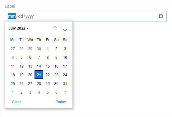
{
    "Date": {
                "fieldType": "date",
                "title": "Label",
                "minValue": "01/01/1900",
                "maxValue": "01/01/2022"
            }
}
How it looks on the user interface:
Area for entering a text paragraph
Field declaration: "fieldType": "textarea"
Available properties:
- Label:
"title": "stringValue",
- Watermark:
"placeholder": "stringValue",
- Remarks:
"remarks": "stringValue",
- Minimum length:
"minLength": "numberValue",
- Maximum length:
"maxLength": "numberValue",
- Default value:
"supported": "string/number/dateValue",
- Mandatory:
"required": "booleanValue",
- Read-only:
"readonly": "booleanValue",
- Repetition:
"repeat": {"min": "numberValue", "max": "numberValue"},
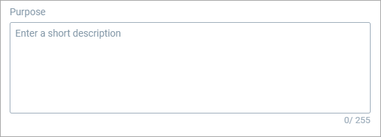
{
    "TextArea": {
                "fieldType": "textarea",
                "title": "Purpose",
                "placeholder": "Enter a short description",
                "minLength": "0",
                "maxLength": "255"
            }
}
How it looks on the user interface:
Drop-down field
Field declaration: "fieldType": "dropdown"
Available properties:
- Label:
"title": "stringValue",
- Watermark:
"placeholder": "stringValue",
- Remarks:
"remarks": "stringValue",
- Default value:
"supported": "string/number/dateValue",
- Mandatory:
"required": "booleanValue",
- Read-only:
"readonly": "booleanValue",
- Repetition:
"repeat": {"min": "numberValue", "max": "numberValue"},
- Options:
"options": [{"value": "string/numberValue", "title": "stringValue"}].
{
    "Dropdown": {
                "fieldType": "dropdown",
                "title": "Label",
                "placeholder": "Select an option",
                "options": [{"value": "1", "title": "Option 1"},{"value": "2", "title": "Option 2"},{"value": "3", "title": "Option 3"}]
            }
}
How it looks on the user interface:

Radio button(s)
Field declaration: "fieldType": "radiobutton"
Available properties:
- Label:
"title": "stringValue",
- Remarks:
"remarks": "stringValue",
- Default value:
"supported": "string/number/dateValue",
- Mandatory:
"required": "booleanValue",
- Read-only:
"readonly": "booleanValue",
- Repetition:
"repeat": {"min": "numberValue", "max": "numberValue"},
- Options:
"options": [{"value": "string/numberValue", "title": "stringValue"}].
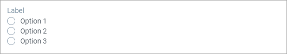
{
    "Radiobutton": {
                "fieldType": "radiobutton",
                "title": "Label",
                "options": [{"value": "1", "title": "Option 1"},{"value": "2", "title": "Option 2"},{"value": "3", "title": "Option 3"}]
            }
}
How it looks on the user interface:
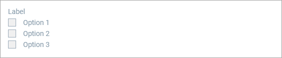
Checkbox(es)
Field declaration: "fieldType": "checkbox"
Available properties:
- Label:
"title": "stringValue",
- Remarks:
"remarks": "stringValue",
- Default value:
"supported": "string/number/dateValue",
- Mandatory:
"required": "booleanValue",
- Read-only:
"readonly": "booleanValue",
- Repetition:
"repeat": {"min": "numberValue", "max": "numberValue"},
- Options:
"options": [{"value": "string/numberValue", "title": "stringValue"}].
{
"Checkbox": {
                "fieldType": "checkbox",
                "title": "Label",
                "options": [{"value": "1", "title": "Option 1"},{"value": "2", "title": "Option 2"},{"value": "3", "title": "Option 3"}]
            }
}
How it looks on the user interface:
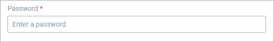
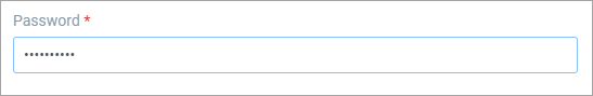
Field for entering passwords
Field declaration: "fieldType": "password"
Available properties:
- Label:
"title": "stringValue",
- Watermark:
"placeholder": "stringValue",
- Remarks:
"remarks": "stringValue",
- Mandatory:
"required": "booleanValue",
- Read-only:
"readonly": "booleanValue",
- Repetition:
"repeat": {"min": "numberValue", "max": "numberValue"}.
{
    "Password": {
                "fieldType": "password",
                "title": "Password",
                "placeholder": "Enter a password",
                "required": "true"
            }
}
How it looks on the user interface:
Embedded file
Field declaration: "fieldType": "embeddedfile"
Available properties:
- Label:
"title": "stringValue",
- Remarks:
"remarks": "stringValue",
- Default value:
"supported": "string/number/dateValue",
- Mandatory:
"required": "booleanValue",
- Read-only:
"readonly": "booleanValue",
- Repetition:
"repeat": {"min": "numberValue", "max": "numberValue"}.
{
"EmbeddedFile": {
                "fieldType": "embeddedfile",
                "title": "Some file name"
            }
}
How it looks on the user interface:

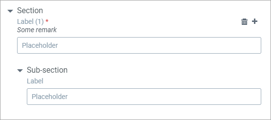
Expandable/collapsible section to group components
Field declaration: "fieldType": "section"
Available properties:
- Label:
"title": "stringValue",
- Remarks:
"remarks": "stringValue",
- Mandatory:
"required": "booleanValue",
- Read-only:
"readonly": "booleanValue",
- Repetition:
"repeat": {"min": "numberValue", "max": "numberValue"}.
{
"Section": {
        "title": "Section",
        "fieldType": "section",
        "fields": {
            "Text": {
                "fieldType": "text",
                "title": "Label",
                "placeholder": "Placeholder",
                "remarks": "Some remark",
                "minLength": "1",
                "maxLength": "9",
                "required": "true",
                "readonly": "false",
                "repeat": {"min": "1", "max": "9"}
            },
            "SubSection": {
                "title": "Sub-section",
                "fieldType": "section",
                "fields": {
                    "Number": {
                        "fieldType": "number",
                        "title": "Label",
                        "placeholder": "Placeholder",
                        "minValue": "0",
                        "maxValue": "5",
                        "required": "false",
                        "readonly": "false"
            }
                }
            }

        }
    }
}
How it looks on the user interface:
To create a form:
- On the Programs page, click the name of the program for which you want to create forms.
- On the Program Setup tab, under Forms, click Create.
- From the drop-down menu, select one from the following options:
- Complex Form
Click to view the procedure- In the Create Data Form dialog, in Name, Description, Category, enter the name, description and category for your data form.
- On the General tab, in Form Template, enter a template for your form in a JSON format.
Click to view the exampleCopy{
"section1": {
"fieldType": "SECTION",
"title": "Patient Information",
"remarks": "This is Section 1",
"readonly": false,
"fields": {
"firstName": {
"fieldType": "TEXT",
"title": "FirstName",
"placeholder": "Enter First Name",
"defaultValue": "Name",
"required": true
},
"lastName": {
"fieldType": "TEXT",
"title": "Last Name",
"placeholder": "Enter Last Name",
"required": true
},
"description": {
"fieldType": "TEXTAREA",
"title": "Description",
"placeholder": "Enter Description",
"defaultValue": "Description",
"required": false,
"maxLength": 300
},
"age": {
"fieldType": "TEXT",
"title": "Age",
"placeholder": "Enter Age",
"required": true
},
"birthDate": {
"fieldType": "DATE",
"title": "Birth Date",
"defaultValue": "2000-09-10"
}
}
}
}
To view how the template is resolved, click Show Form Preview. On the Record tab, in Record Header, enter the name for the record, and then in Form Template, enter a template for your form in a JSON format. To view how the template is resolved, click Show Form Schema.
- Simple Form
Click to view the procedure- In the Create Simple Form dialog, in Name, Description, Category, enter the name, description and category for your data form.
- In Form Template, enter a template for your form in a JSON format. To view how the template is resolved, click Show Form Schema.
- Click Save.
Actions with forms
After you add a form to a program, you must publish the form in order to allow data submission. If you do not want submitters to use a particular form, you can choose to suspend the form.
To add a form to a program:
- On the Programs page, click the name of the program to which you want to add forms.
- On the Program Setup tab, under Forms, click Add.
-
The following page is displayed:
- On the Add Forms page, select the required forms from the list.
- Click Add. SDC displays the selected forms in the Forms section of the program with the status Draft.
- Click
 to add more forms to the program. to add more forms to the program.
To publish a form:
- On the Program Setup page, under Forms, select the forms that you want to publish.
- Click
 . After you publish a form, SDC displays this form to all the submitters associated with that program. . After you publish a form, SDC displays this form to all the submitters associated with that program.
To suspend a form:
- On the Program Setup page, under Forms, select the forms that you want to suspend or delete.
- Click
 . When you suspend a form, it is no longer available to submitters for data submission. . When you suspend a form, it is no longer available to submitters for data submission.
To edit a form:
- On the On the Program Setup page, under Forms, click

- Enter the name and description that you want and then click Save.
|
|

